
momentum
An interactive app for 18-24 year-olds that helps beat procrastination and find balance between productivity and rest, without guilt.
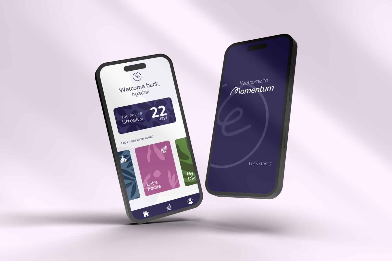
The short version. Momentum is a focus and rest app for 18-24 year-olds. A survey of 12 people pointed at something I did not expect: the guilt does not come from resting, it comes from resting with the work still open. So instead of another timer, the product is designed around closing the loop, making "done" feel done so stopping feels allowed. It is a high-fidelity Figma prototype validated with heuristics and benchmarking, not yet with users.
The problem
Most productivity apps assume the same thing: you procrastinate because you can’t manage your time. So they hand you another timer.
But when I looked closer, time wasn’t the issue. Between 80 and 95% of students procrastinate, and around half do it chronically, not because they misread the clock, but because of how the task makes them feel. In a culture that treats constant output as the default, 18-24 year-olds get caught in a loop of stress, guilt and low self-esteem.
The most interesting thing I found wasn’t a lack of time. It was a confusion between rest and procrastination. People couldn’t let themselves rest without feeling guilty, so they never really rested at all.
Research
I ran a survey with 12 people aged 18-25. A few numbers:
- 8 of 12 feel "frustrated and guilty" after procrastinating.
- 6 of 12 describe their routine as "loosely structured".
- 5 of 12 feel guilty "sometimes" simply for resting.
- Only 2 of 12 use any strategy to manage their time.
The quotes said more than the numbers:
When I rest I don’t feel guilty. When I procrastinate, I do.
Procrastination is when I have things to do but I freeze and decide to put them off. Rest is when I have nothing left pending.
That second quote was the whole project. The guilt doesn’t come from resting. It comes from resting before the work is closed. This lines up with what psychologists already knew: procrastination is an emotion-regulation problem, not a time-management one (Sirois & Pychyl, 2013). We delay to dodge a feeling, then the feeling follows us into the break.
Meet Agatha, 21. She studies, works part-time, and ends most days having done a lot of something but none of the thing that mattered. When she finally stops, she doesn’t switch off. The unfinished task sits there, so the rest never counts.
The insight that steered the product
If the guilt comes from open tasks, then the answer isn't more rest. It is helping people close the loop, so the rest feels clean.
There’s research behind this too: rest only restores you when you mentally detach from work (Sonnentag). Guilt is precisely what blocks that detachment. So Momentum’s real job isn’t to time your breaks. It is to make “done” feel done, so you are allowed to stop.
Design decisions
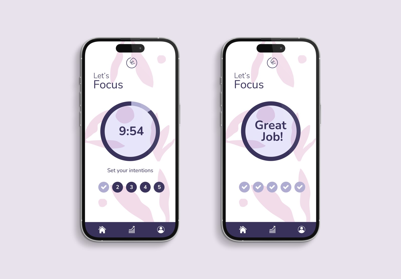
Design the ending, not the timer. Every other app celebrates starting a focus session. I put the weight on finishing one. Each step you complete gets a check, and closing a session brings up a summary and a motivational message. The point isn’t decoration. It is making completion visible enough that resting afterwards stops feeling like cheating.
The rest of the decisions came from Nielsen/Norman heuristics, applied explicitly:
- Visibility of system status. A gradient circle that fades as time passes, instead of an isolated number. You feel progress, you don't just read it.
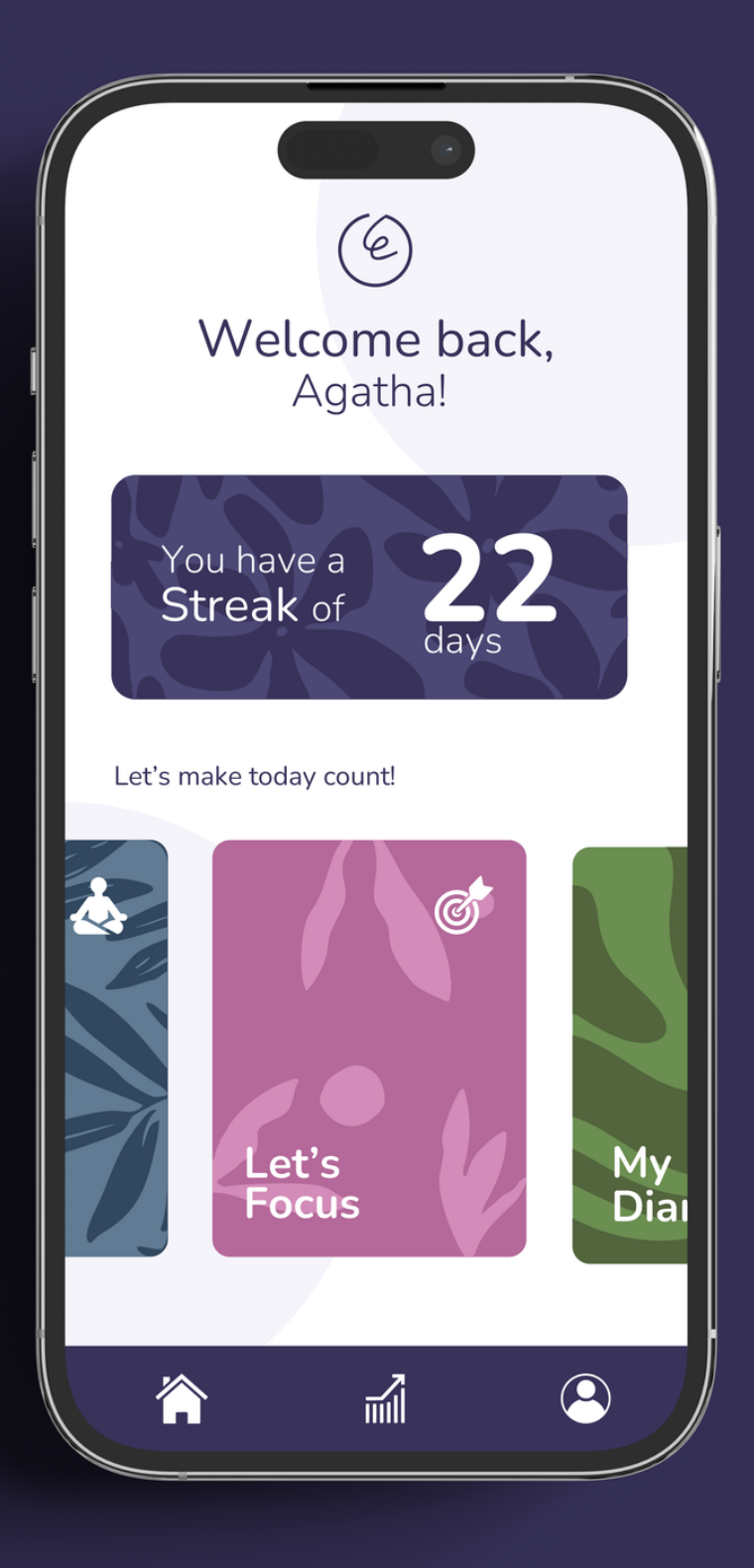
- Recognition over recall. Large, obvious cards on the home (Let's Focus, My Diary, Let's Meditate) that lower mental load and make the next action a glance, not a decision.
- User control and freedom. Focus intervals are configurable (15, 25 or 50 minutes), for beginners and for deep work, not one rigid block imposed on every brain.
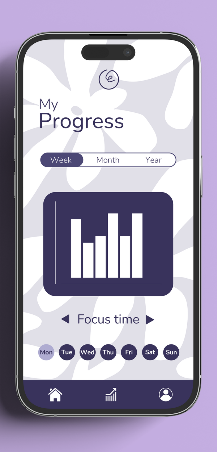
- AI personalization, defined honestly. The system reads usage signals (sessions completed, time of day, tasks abandoned mid-way) and suggests a concrete adjustment, a shorter interval or an actual break, instead of applying the same formula to everyone.
Benchmarking and differentiation
I studied three references and took the best of each, while avoiding their limits:
- Forest. Its focus environment inspired me, but its gamification (growing a tree, water points, sunlight) can become the distraction itself. I replaced the tree with a gradient circle: more legible, less childish.
- Headspace. I borrowed its "boxes" idea to sort activities into cards. But Headspace is about calm; Momentum is about closing tasks so calm is allowed.
- Pomodoro. I kept its time blocks but made them flexible, not rigid 25-minute chunks that cut you off mid-flow. (Visual reference for the timer: the YouTube channel ADHD Couple.)
The difference from all three: personalization instead of a single formula, and treating rest as the goal, not the reward for productivity.
What I built
A high-fidelity prototype in Figma, validated with a heuristic evaluation and benchmarking:
- A home screen with a streak counter and the activity cards (Let's Focus, My Diary, Let's Meditate).
- A focus flow with the gradient circle, "set your intentions" steps, and per-step checks.
- A completion state, the "Great Job!" screen plus a summary, that closes the emotional loop.
Honest about scope: this stayed at heuristics plus benchmarking. No user testing yet (see below).
Heuristic self-evaluation
I went through Nielsen’s heuristics one by one against the actual screens: visibility of status (the fading circle), feedback (checks and end-of-session summary), recognition over recall (the cards), user control (configurable intervals), error prevention (clear, bounded steps). Doing it explicitly, with concrete examples from the product, is an honest form of self-assessment, and I would do it again.
What I’d test next
The heuristic pass is honest, but it is my own judgement, not a user’s. The next step is to put the prototype in front of the people it’s for and test the one claim the whole product rests on: that closing the loop makes rest feel guilt-free.
- 5 to 8 users, 18 to 25. A moderated Maze or in-person test of the focus-to-completion flow. Can they start, complete and close a session without help?
- The guilt hypothesis, measured. Ask before and after: did the completion screen actually make stopping feel allowed? That's the bet, and it either holds or it doesn't.
- The gradient circle vs a number. Does the fading circle read as progress, or do people still want the digits? An easy A/B in testing.
- Where it breaks. If users abandon mid-session or ignore the suggested adjustment, the personalization logic needs rethinking before any visual polish.
What I learned
Designing solo forces you to defend every decision without hiding behind a group. That muscle served me later on abbado.
The survey completely changed the product’s direction. Had I designed on intuition, I would have built just another generic productivity timer. Instead the data pointed at guilt, and guilt pointed at the whole concept.