
cirro
A calm companion that helps 7-to-12-year-olds organize their homework and regulate their emotions.
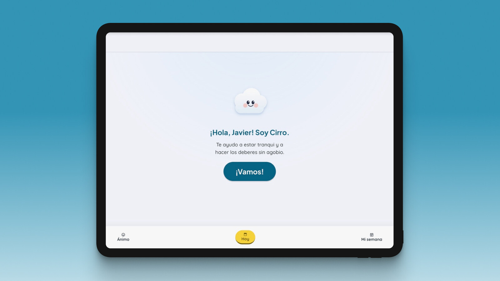
The short version. Cirro is a calm homework companion for kids aged 7 to 12 that puts emotional regulation before the work: the child picks a mood, the app routes the session (a worried child is never pushed to study), then runs an age-based focus timer. Privacy lives in the schema, not a policy page: no real name, no stored words, security per household. It is built and deployed; the early design concept tested well in Maze, and the kid-facing build still needs real testing with children.
the problem
A nine-year-old comes home to a pile of homework. It isn’t that he doesn’t know the material. It’s that the pile overwhelms him, the overwhelm makes it harder to start, and every afternoon that ends without him starting confirms the story that “he’s bad at this.” The problem isn’t content. It’s executive function and emotional regulation: how to get organized, how to start, how to hold focus, and how not to fall apart along the way.
Almost every tool for kids attacks the wrong part. They capture homework (something Google Classroom already does) or gamify the content, but none of them treat the emotional state as a prerequisite for the work rather than a nice-to-have. And the support around a struggling child (psychologist, teacher, guidance department) all works in parallel, with none of the information ever connecting.
Cirro starts from a premise that’s almost too obvious to say out loud: regulate first, then work. A calm, supported child can plan and concentrate; an overwhelmed one can’t. So the emotional scaffolding carries just as much weight as the organizational kind.
I started thinking about classmates of mine who always struggled in class, and how it weighed on them even outside of school. I came from a very demanding private school, full of pressure, where the system was the same for everyone. I wanted the opposite: something that adapts to each child, not the child to the system. That’s why Cirro was, from the start, for kids.
the research
I didn’t want to design on adult intuitions dressed up as pedagogy, so I worked in two layers: a classic UX research process to understand the person and their context, and an evidence base that graded every claim by how strong the research behind it actually was.
The UX research. The persona I built for the academic exercise was an older student, further from the kids I really wanted to help, a drift I carried all the way into the test:
Irene, 23, Lisbon. She’s a third-year law student. She struggles to get started and to stay organized when she studies, and feels that without study tools that actually work she won’t reach her exams properly prepared. The pressure and the lack of focus feed each other.
From Irene I mapped an 8-point journey, from getting home from class to understanding the material, its emotional arc, the scenarios where the system fails (what if the psychological support isn’t effective? what if the departments don’t talk to each other?) and a service blueprint connecting guidance, mental health and teachers.
The benchmarking. Duolingo, Daylio, My Study Life and Shiken AI, positioned along engagement versus study organization. None of them crossed the three axes I cared about: organization, emotion and tutoring in a single product.
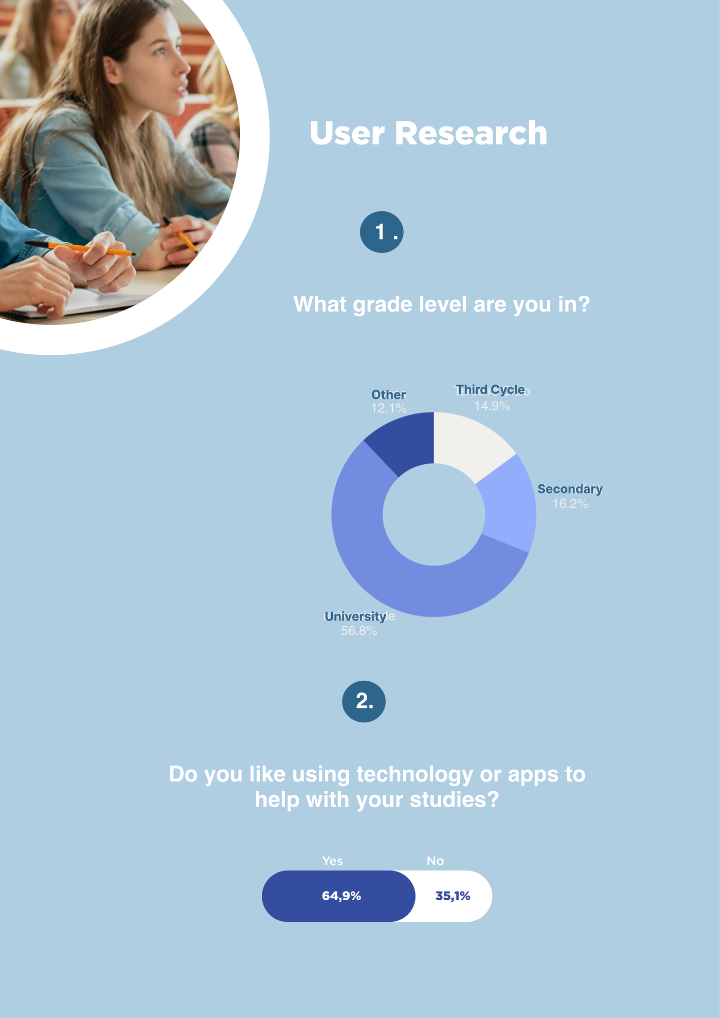
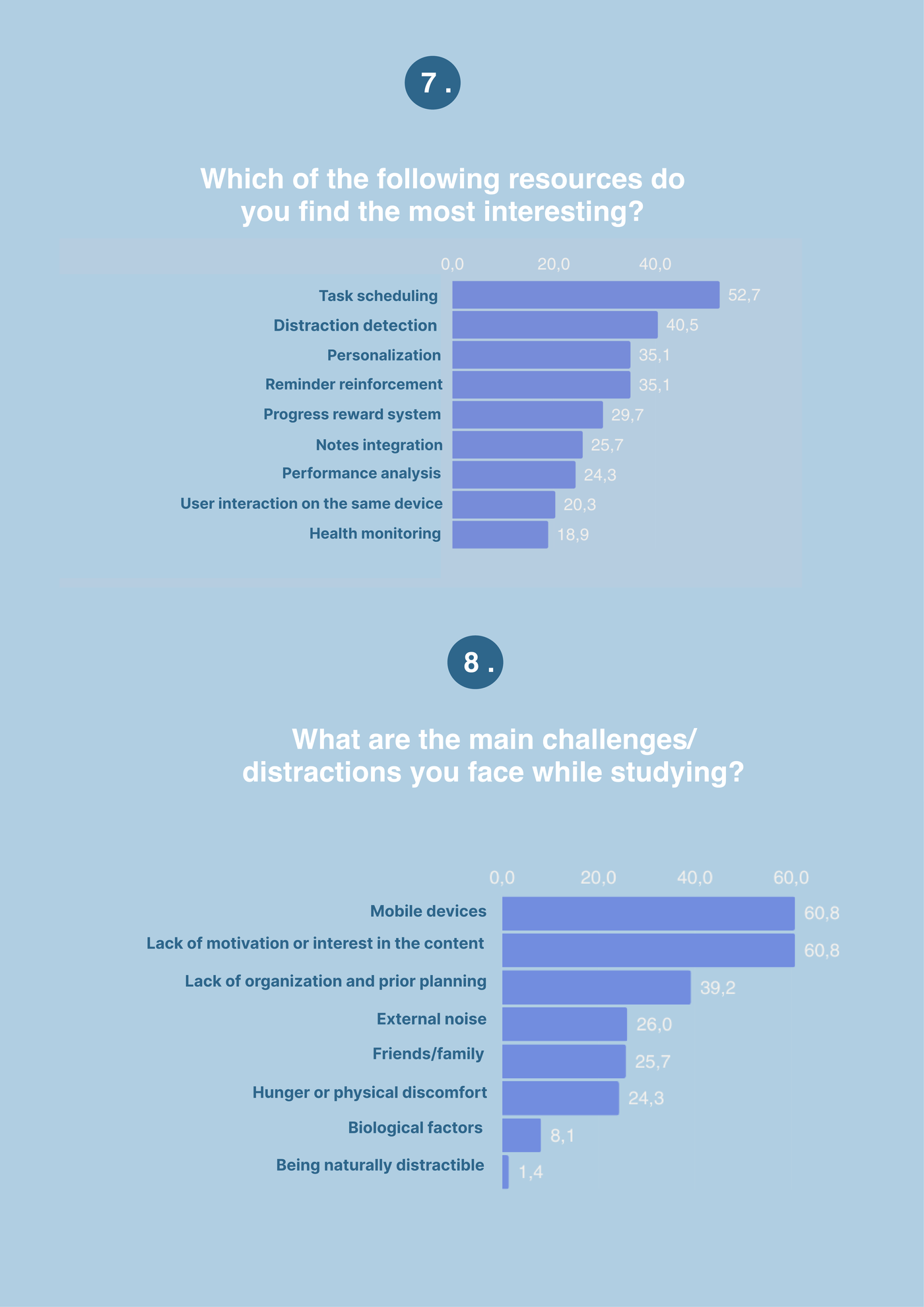
The survey. I ran a questionnaire to check the context against real users (a mostly university sample, 57%). Mobile devices and lack of motivation came out as the biggest distractions (61% each), ahead of poor organization (39%); and among the features people wanted, task scheduling (53%) and distraction detection (41%) led. That sharpened the target audience and the product’s priorities.
The evidence base. As the project grew toward a real product, I went deeper into the psychology, building on named, checkable frameworks. The backbone:
- Self-determination theory (Deci & Ryan), autonomy (the child picks the mood, the tool, which homework, and when to start or stop), competence (work broken into small steps, at their own pace) and relatedness (a companion with a name).
- Growth mindset (Dweck), praise the process (“you stuck with it,” “you planned that yourself”), never the trait (“you’re so smart”), because praising the trait makes kids avoid challenge and collapse when they fail.
- Emotion coaching (Gottman, RULER), validate before applying any technique, and “name it to tame it” (Lieberman) to bring the arousal down by putting a name to the emotion. The daily loop closes on regulation, not on “done”: if the child is still low, it offers one more breath rather than leaving them overwhelmed.
The most solid part, and the one that helped me most in making interface decisions, was the one on visual load and color. What’s defensible:
- Visual clutter hurts every child’s attention, and they don’t habituate to it (Fisher, Godwin & Seltman 2014; no habituation at 15 weeks, Godwin 2022). Hence: one focus per screen, few elements.
- Arousal is driven by saturation and brightness, not hue (Valdez & Mehrabian 1994; Wilms & Oberfeld 2018). Hence: a light, desaturated canvas, with high saturation reserved for the single “do this now” action.
- Curves read as safe; angles fire the amygdala (Bar & Neta 2006). Hence: rounded corners and soft typography.
And what I decided not to use, however tempting: color that “heals” or “balances energy” (pseudoscience), “dyslexia fonts” (the benefit is the spacing, not the typeface), and “red hurts you / blue for creativity” (it doesn’t replicate cleanly). The strongest evidence is for socio-emotional programs as a whole (Durlak 2011; Cipriano 2023); for an isolated microtechnique in 7-to-12-year-olds it’s thinner. That’s why every technique carries its level of evidence, and I never claim Cirro “reduces anxiety,” only that it’s evidence-informed.
from prototype to product
With the UX research done, I built a high-fidelity Figma prototype and tested it in Maze with users in the target range of that early concept.
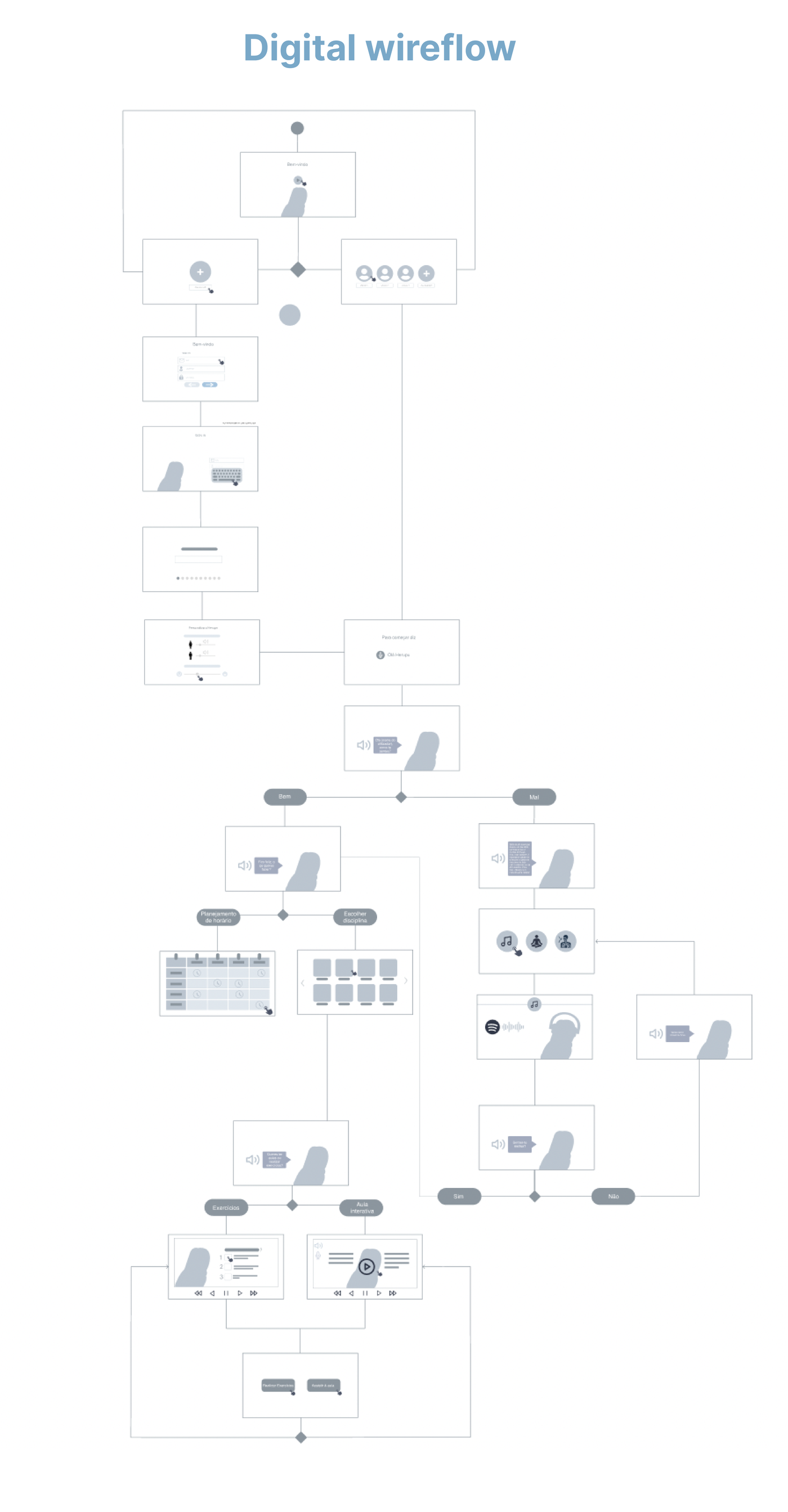
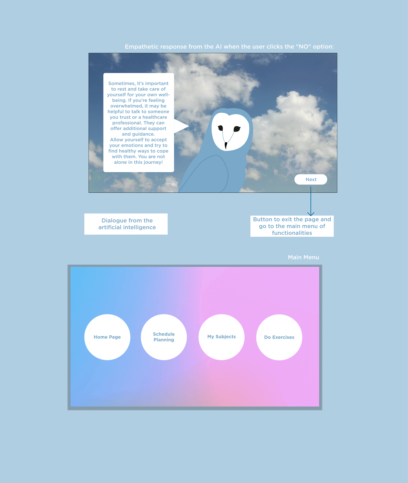
The prototype was called Herupu then, and its mascot was an owl over a cloudy sky, that cloud is what later gave Cirro its name and shape.
The test data:
- 88% said the app was easy to use.
- 100% found the design satisfactory.
- 71% would use it while studying.
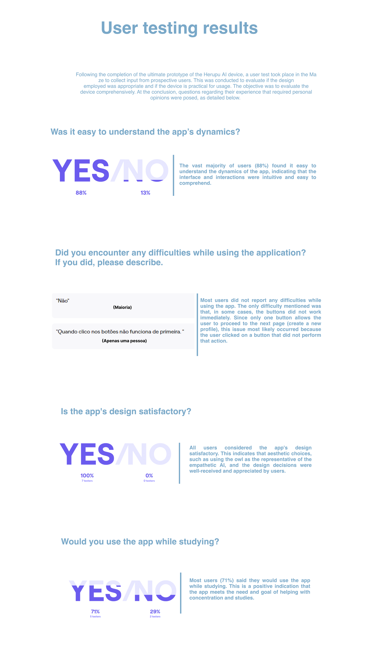
I have to be honest about what those numbers measure: they validate the early prototype, the Figma concept of a study companion for students with anxiety, built around the persona “Irene, 23.” They do not measure the app I ended up shipping. They still count for a lot in a portfolio: they’re evidence that the design worked in the hands of someone who isn’t me, and that the rapid-testing tool delivers, in two days you have 30 responses with click maps and time on screen.
That prototype validated well, but the academic version tried to do too much at once (organization + emotional support + AI tutoring) and I’d tested it with a sample older than the kids I had in mind. So when I built the product I narrowed the scope to the core the evidence actually backed, regulate first, organize second, let go of the content-tutoring piece, and aimed it at kids aged 7 to 12, who it was always for. And, above all, I decided to stop designing screens and actually build it.
from research to product
That whole base produced the product decisions that order everything else.
One promise: regulate first. The mood triage runs the show. The child picks from six states and the routing decides the path, not me: worried, angry or sad → an emotional check-in first, never pushed to study; tired → gentle movement; happy or calm → straight to the homework. Emotion isn’t a welcome screen, it’s the first node of the state machine.
Calming tools matched to the emotion, each with its own basis. Slow breathing for the worried child (a longer exhale to lift vagal tone, no numbers, capped at 6 breaths). Tense-and-release for the angry one, following CHOP’s progressive muscle relaxation protocol, because anger discharges through the body and never through a “calm down”. 5-4-3-2-1 grounding as a second line if that didn’t work. Movement for the tired or sad child (behavioral activation, not study pressure) and, since it’s the weakest evidence in the set, always offering “rest” as an alternative.
Age-based Pomodoro + active break. Focus runs 10 min (ages 7 to 9) or 15 min (ages 10 to 12), well below the adult 25-minute block, because a child’s sustained attention is around 2 to 5 minutes per year of age. A visual “Time Timer”-style disc that empties, with the digits optional (remembered per device, designed for kids who are time-blind or anxious), pause and resume, and no auto-restart: the child chooses another round or stops. Breaks are short and active.
The child writes their own homework. Subject → day → optional “what is it?” → confirm. It looks like friction, but the act of writing the homework down is the executive skill we’re training, so it’s deliberate.
Privacy by design, not as an add-on. The adult’s dashboard shows patterns of mood × load over time, conversation starters, never transcripts, never the child’s words. The free-text field for “letting out a worry” is ephemeral and on-device; it’s never stored. The child knows the adult can see their mood. That mood×load pair, shown to an adult without surveillance, is the product’s defensible value, not the homework capture.
what I built
Cirro is deployed on Vercel and live to use: cirro-ruddy.vercel.app. It’s a real production build with the Vercel adapter, not a mockup.
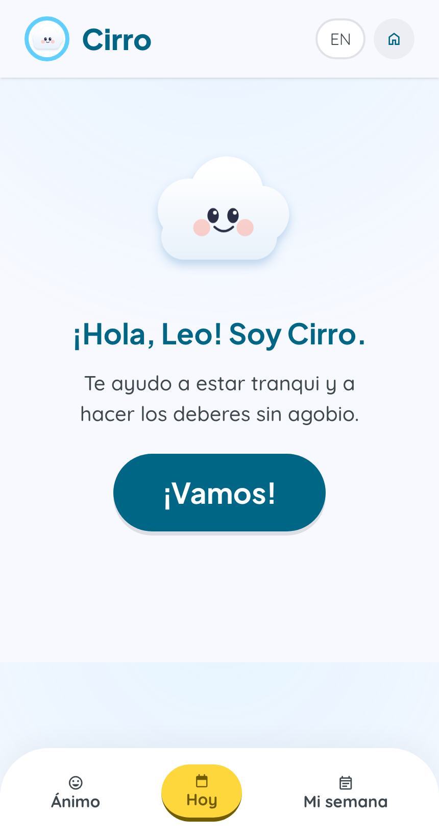
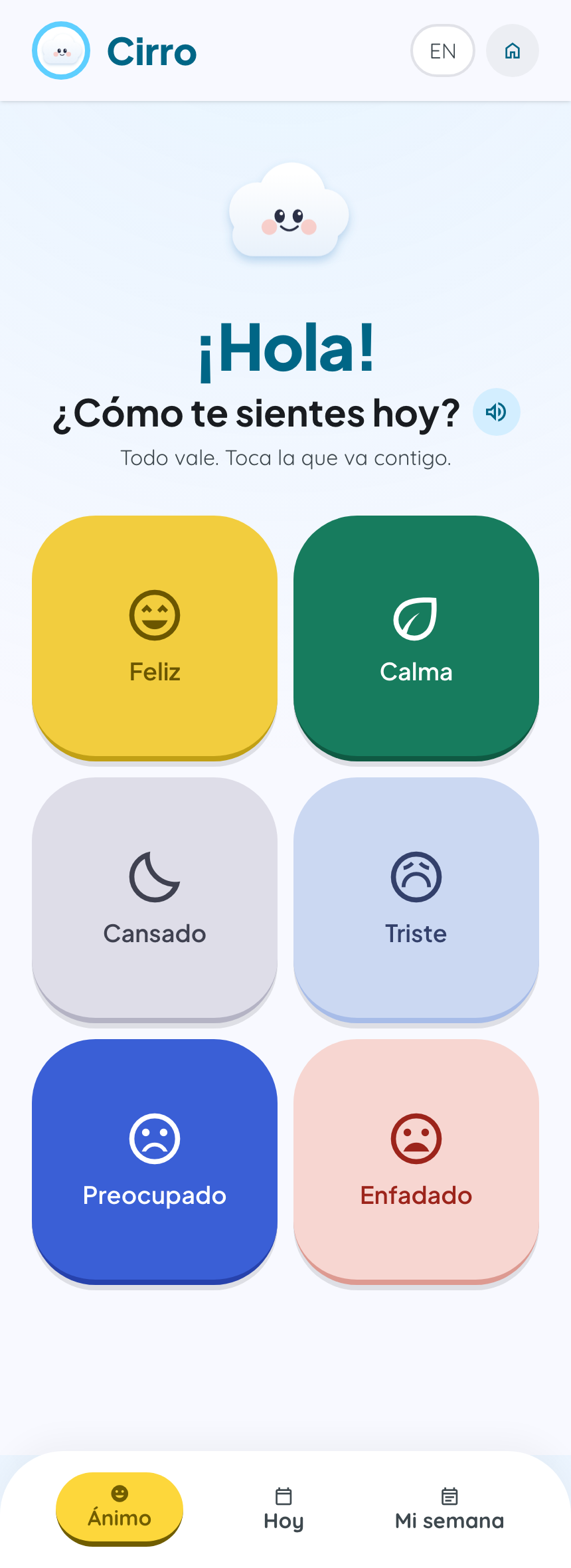
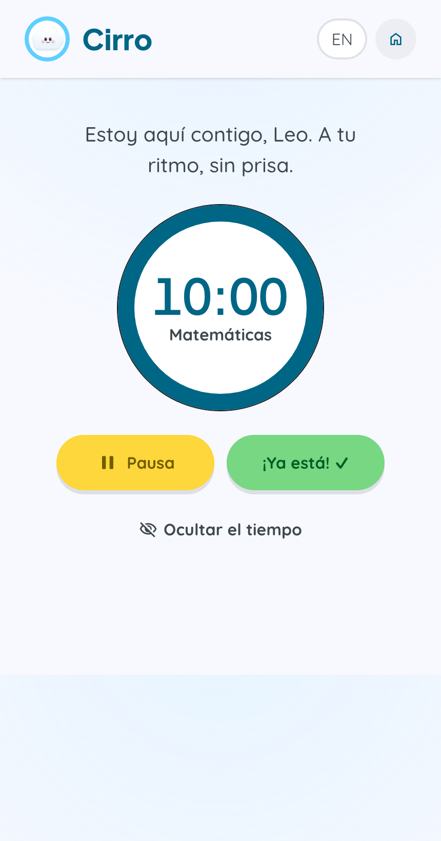
- Stack: SvelteKit and TypeScript on the front, Supabase (Postgres + Auth + RLS) as the source of truth, shipped as an installable PWA with an offline shell.
- The child’s loop lives as a single-screen state machine (~1,000 lines, 30+ steps): mood → calm → homework → focus → celebrate → reflection → final mood → recap, and from there to the adult dashboard. Read-aloud (Web Speech API) on every speech bubble, full ES/EN i18n.
- Real privacy in the schema, not in a PDF: the child has no account (the session always belongs to the adult, “kid mode” is a view), the schema stores only a nickname, no real name, no date of birth, with
age_bandlimited to'7-9'|'10-12'. Row-Level Security per household across all 7 tables. A real right to be forgotten via thedelete_account()RPC, which cascades the deletion of the household and the auth user. Self-hosted fonts (no Google CDN to leak a minor’s IP), zero third-party analytics. - An honest safety guard: in ES the children’s helpline
116 111(ANAR) is shown; in EN it’s deliberately disabled (null) so we don’t show a child the wrong number in an unverified geography, it falls back to “talk to a trusted adult.” The file header says, literally, “VERIFY BEFORE SHIPPING TO REAL CHILDREN.”
The mascot is, for now, an SVG cloud, Cirro, the cloud.
What is NOT built, and I’ll say it plainly: the fading scaffolding (Vygotsky’s autonomy ladder, where the system does less and less as the child internalizes the routine) is future work, not a live product. Also still pending: a helpline verified by a professional for each geography, a real safety protocol with a human in the loop (there isn’t one today), a reinforced DPIA + privacy policy + verifiable parental consent (today consent is just one more required checkbox plus an adult gate that the docs themselves admit isn’t real security), planner OCR, import from Classroom/Seesaw, packaging to the app stores, and validating the wellbeing effects through a study of my own.
the name
From owl to cloud. The first guide was an owl, wise, watchful, the one who knows. But an owl looks at you, and on an app built around no judgment and no pressure, that quietly turns a companion into a teacher. So the guide became a cloud: it sits beside the child, never above them. It carries no authority, drifts gently, and changes shape, a quiet nod to a growth mindset.
Why Cirro. Not just any cloud, but a cirrus, the highest, lightest cloud in the sky, the one that signals fair weather ahead. The name says it in a single soft word a seven-year-old can pronounce: calm, lightness, clear skies. Exactly what the app is for. And in Spanish, cirro is literally the name of that cloud, so the name and the mascot are the same word.
what I learned
- The right product is rarely the first one you design. The early concept validated well in Maze (88% found it easy to use) and I still narrowed it from “everything at once” to “regulate first” and rebuilt it for the kids it always aimed at. I learned to treat a good test result as a signal of direction, not as permission to change nothing.
- Designing for regulation forces a level of honesty with the evidence that no brief asks for. I learned to grade every claim: “evidence-informed” isn’t the same as “proven in this app,” and the difference is the line between a serious product for children and one that overpromises. Every piece of microcopy matters when you’re designing for anxiety.
- Privacy is designed into the schema, not into a legal text. That the child’s words can’t be stored because the field is ephemeral, and that a household only sees its own rows thanks to RLS, is worth more than any privacy-policy paragraph.
- Scaffolding that’s hardcoded isn’t scaffolding. It’s very easy to ship screens that look like they adapt to age without actually doing so. I’d rather mark it as honest future work than pretend it’s already there.
what I would change
- I’d test before building this much. I know how to do user research, I did it in the early phase with Maze, and even so, on the rebuild, I dove straight into coding. I started from my own understanding of the problem and built a huge amount before validating: I’ve only had informal feedback, the planned alpha (2 to 3 real households for a week) hasn’t happened, and there’s no wellbeing study at all. Next time: cheap prototype and real users first, code after.
- I’d test with real kids aged 7 to 12, not with peers. Those results came from the academic version, tested with older students and a sample skewed toward people who already know what UX is. The app hasn’t been tested at that scale with kids, and it should be before I talk about its impact.
- I’d close the launch gates before talking about real children: verify the helpline, set up a safety protocol with a human in the loop, and the DPIA with reinforced consent. Until then, Cirro is a product that’s honest about what it isn’t yet.